Stratus Dashboard
Stratus is a fintech startup that helps young adults manage expenses.
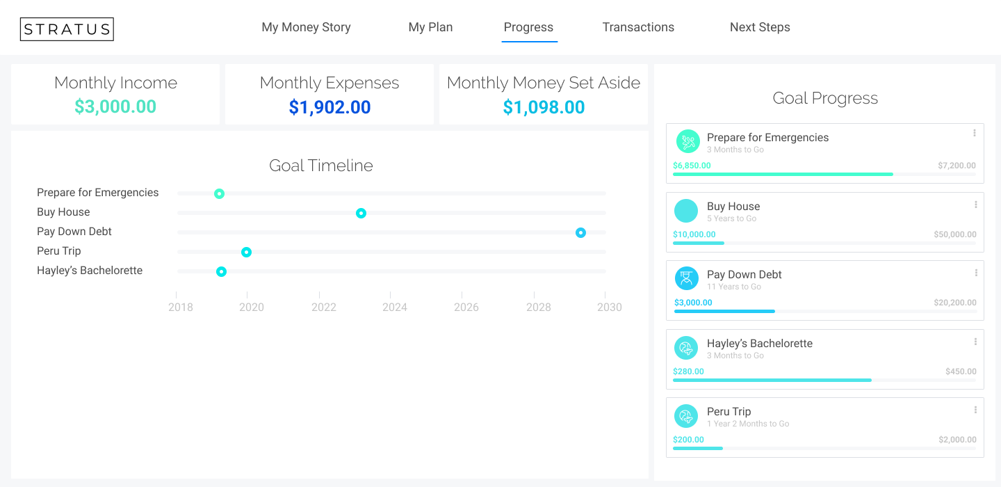
I designed a dashboard for when users first log into Stratus to get a high level overview of their progress in meeting their goals and where they are in their spending plan.
Users
User between the ages of 23 - 33 struggling to understand finances and pay down debt. Our main focus is the user persona named "Struggling Steve/Stacy," who needs to pay off student loans, cover necessary expenses, and needs help with future financial planning.
These users need help creating a spending plan to help reach their goals.
User spending plan and goals were in multiple places on the platform. While we were building out the different financial goal flows, I designed ideas for a dashboard where users could see all their progress toward their goals as well as where the stood with their financial budget.
Problem Statement: As a user, I need a high level view of where I am with all my goals and finances.
Problem
Iteration 1
High level view of monthly income, Monthly expenses and savings. Users could adjust their goal timeline.
Challenges and Questions I had:
How do we allow users to update their goal timeline while showing that it impacts other goals?
Do users update their goals by updating the timeline (i.e., I want to pay my student loans faster) or by updating their spending plan (i.e., I canceled my HBO and Hulu subscriptions, does that move up my timelines?)
Default View
Timeline Adjustments
Iteration 2
After quick usability / prototype testing with peers, the first iteration posed problems with complexity and understanding what users were able to do on the dashboard. I came to the conclusion that users might only need to simply see their income, expenses, savings and timeline for goals.
Default View
While hovering on indicator
While hovering on goal
Ideas for what happens if user clicks “edit goals”
Challenges & Conlcusion
Due to the fact that we were focusing on building out the current financial flows, unfortunately there was no time to prioritize user testing for these dashboards. I believe it is crucial to execute prototype tests and usability tests for data visualizations iteratively.
I left before we were able to implement these dashboards at Stratus, but my hypotheses was that it would have solved for a lot of user pain points (i.e., not having to hung around for income, spending, and goal tracking.)
Looking back
Color contrast and interactions (hovers) do not meet accessibility requirements. Design should be inclusive.
Designs and data visualizations would have greatly benefited from multiple iterative prototype and usability tests.


